How to Make a Landing Page
A sales page or landing page is often the most important page to get leads or conversion. You can either utilise a sales page through a Google ads campaign to lead visitors to your page or through Search Engine Optimisation methods. Either way, once you’ve gotten the visitor to your website, your landing page should make the customer convert. Either by means of emailing you or calling you directly. If your landing page is not convincing, whatever efforts you use for marketing or organic visitors won’t mean a thing.
The structure of landing pages is often an art and it takes a lot of tweaking to find out the best format that converts best. It is not a guesswork and should be backed up with data and if possible, A/B testing to find the best format or headlines.
As such, I would like to share the 10 checks you should use for your landing page before launching.
10 Checks Before Launching Your Landing Page
Headline Text

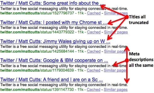
Whether you are getting traffic from Facebook, Google Ads or organic searches, it is important to grab the attention of your potential clients with a catchy headline. Your headline determines how hooked the client is to your product/service. If you are using Google ads or organic search engine pages, make sure that your title tag properly defines your product and service and the description should support your title tag. This is the same for your Facebook post or ad, the first sentence should describe your service and the subsequent sentence giving support to the product or service. For our campaigns, we found that using numbers to support your service makes a great impact on our campaigns. Headlines such as “Professional Cleaning Services with Over 10,000 concurrent cleaning contracts” Or “save 20% on our services with every 1-year contract” numbers usually reach out to the analytical business minds of individuals and it usually works wonders in almost every industry.
Above the Fold Content

“Above the fold” content refers to the content that the visitor is presented with the moment he enters your site. Below the fold content, on the other hand, refers to content that he needs to scroll down in order to see. The above the fold content should match the title tag and description tag that enticed the visitor to click. This will match their expectations with reality and make them stick to your page read on. Not click out, or bounce.
Avoid Unnecessary Links
Your landing page should not have any unnecessary links for visitors to click away. Always remember that your landing page is there to sell your product. Giving them something else to read about will distract people from what you want them to do and cause a delay from your objective… which is converting them into sales.
Distracting Content
It might be tempting to add elements that can beautify or improve the experience for the visitor but are often counterproductive to converting. Always remember that too much information, images or video content can discourage a user from making the next step in your marketing funnel. If that information is not necessary for your sales, don’t put it in.
Call to Action

Assume you managed to convince the visitor to take the next step and fill up their information or credit card details. A good call to action is needed. Ask yourself if you need the customer to call you or send you an email. If an email is needed. Make sure only necessary details is required. I’ve seen so many calls to action contact forms fail because the visitor was uncomfortable with the number of fields and details was required. With the number of security lapses going on, people are less willing to provide key information and this can lead to poor conversions. In most cases, you should only need the following information: Name, Email. Other forms of information such as contact number should only be required after some follow up through email correspondence.
Proofread Your Content
The one thing that ticks me off when I read a sales page is a poor use of vocabulary and sentence structure. It gives me a sense of how much work was put in and the conscientiousness of the writer. And it isn’t just me too. Studies have also shown in an A/B testing scenario that a poorly written sales page with grammatical errors and poor sentence structure tends to have a lower conversion rate than one that has generally no mistake.
It is good practice to proofread your content after you have written it, get someone else to read your content and finally, read it once through after a few hours.
Does my Sales Page Fit the Needs of My Client?
Often times, businesses are too focused on selling their product and service without understanding more about the customer. Customers and visitors visit your website because they have a problem. Not because of how great your business is. Instead of focusing on your product or service. Put yourself in a client’s shoes and structure your sales page around what they need. By doing so, you are able to meet their needs first making them more inclined to lock in with your service/product.
Testimonials
Testimonials are a common sight on almost all websites but are an intangible resource that most visitors are looking for. Most people want a perfect service without any hiccups and testimonials are a great way to assure them that you know what you are doing. If you have testimonials, place them before your call to action and in order of importance. People are more likely to convert when they see a company which they recognise that has used your service or product and have something good to say.
Mobile Optimisation
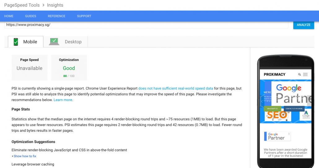
Mobile users contribute to over 40% of visits for all 100+ of my client’s websites and websites that we own. This growing trend is an indication of the growing trend of using just a mobile device as their sole device. Optimise your page and test to ensure that all elements are mobile-friendly and can load quickly. Remember that not everyone has the same access to fast 4G/LTE connection. One suggestion will be to use Google’s AMP for lightning fast speeds.
Test
Before launching your sales page/campaign, it is always wise to test every single element. This means opening the page in different browsers, testing on Android and iPhone platforms, testing the loading page, content forms and proofreading your content once more. You will be amazed at how much money it will save you instead of finding costly mistakes after launching.
Conclusion
After 10+ years in the industry of internet marketing and launching sales pages for our clients, I find that these 10 fundamentals never change. To this day, I use these 10 checks to ensure that my sales page has these essential elements, and it has proven beneficial in most cases.

