Why Font Type Matters
The debate on whether font type matters in marketing and website design has been the debate of the 21st century. With so many different types of fonts available and variations, it can be difficult to choose the right font for your website or material. Here are a few reasons why font matters.
Differentiation of Content Type
Consistency in this manner is about making sure that the different portions of your website have the appropriate font size, type, and differentiation. It needs to be easy for visitors to spot and to understand the different segments of your website. Maintaining these differentiation helps to create a uniformity throughout your website and enhance the user experience.
Take for instance the picture below of an e-commerce site. The title is always the biggest at 20px while the description of the product is 14 px. This allows the user to automatically differentiate between the title tag and the description tags. Our brains have already been programmed this way right when you start using the internet. This is why developers never have to put the title as “Product Title” for you to know the name of the product.

Hierarchy of Importance
It is very common when marketers or content analyst use differently sized font types and sizes to emphasize a certain hierarchy. Ever seen a title that is bolded with all upper case letters? It denotes a sense of urgency and tags a level of importance to that text. Making such subtle changes can change the mood altogether and the importance of select text. A good example will be posters on ads that want to market a certain promotion such as a club like Molecue. They place an emphasis on the pricing of the beer in order to place certain importance to the text. Your eye is likely to be attracted to the price and not the product because of the placement and size.

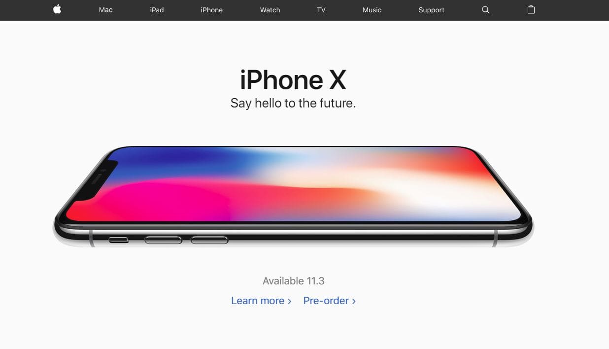
Design Effect
If you are a company dealing with the younger generation, you might want to emphasize more on the design aspect of your website. The younger generation demands exquisiteness, a combination of elements to invoke certain emotions and the use of font to create a nice effect. There is nothing sweeter than a good balance of the perfect font and a well-placed title to invoke certain emotions. By using a mixture of fonts and colors, you can achieve that balance and soothing effect that can invoke individuals to make a purchase. Some great examples are Apple advertisements and their website. Their website is simple yet achieves the desired effect for all their products.
Our Recommendation
While it is important to understand the placement of text, type, colour and size of the font, you should always take into consideration the limitation of the performance of the font. Some fonts that are not widely available in the web might not have the performance you desire and could slow down your website loading speed. For a good selection of fonts, you can try Google Fonts. For websites, you should only ever use a maximum of 3 different fonts for the sections for your website. A font for the main content, another font for the Menu content and lastly another font for items such as your advertising materials. The last thing you want is for every page to have a different font which will ruin the uniformity of the website.
Leave a Reply
Want to join the discussion?Feel free to contribute!